Design and Web team summary – 27 April 2021
The web team at Canonical run two-week iterations building and maintaining all of Canonical websites and product web interfaces. Here are some of the highlights of our completed work from this iteration.
Web squad
The Web Squad develops and maintains most of Canonical’s sites like ubuntu.com, canonical.com and more.
Ubuntu 21.04 (Hirsute Hippo) released
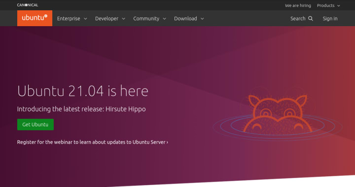
Ubuntu 21.04 was released on all of our supported platforms this iteration. The web supported this with a homepage takeover, updates to the “What’s new” sections of the desktop and server pages, updates to the entire download section and we updated the look of the Raspberry Pi download page
Add linkchecker action to scan OpenStack docs
To further improve the quality of the docs across Canonical we have added two more linkchecker actions which regularly scans the OpenStack docs for broken links. The docs authors at Canonical are the maintainers of two sections of the OpenStack docs:
- https://docs.openstack.org/charm-guide/latest/
- https://docs.openstack.org/project-deploy-guide/charm-deployment-guide/latest/
Brand
The Brand team develop our design strategy and create the look and feel for the company across many touch-points, from web, documents, exhibitions, logos and video.
Juju website update
We supported the Juju.is website update and worked on some illustrations and icons to be used across the site.
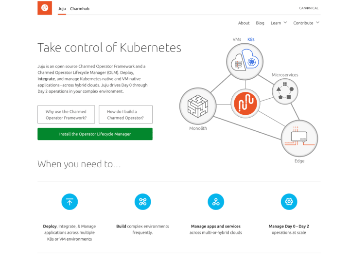

We also worked on the ‘What is Juju?’ interactive section of the site, working on the visuals and also animation sequencing.

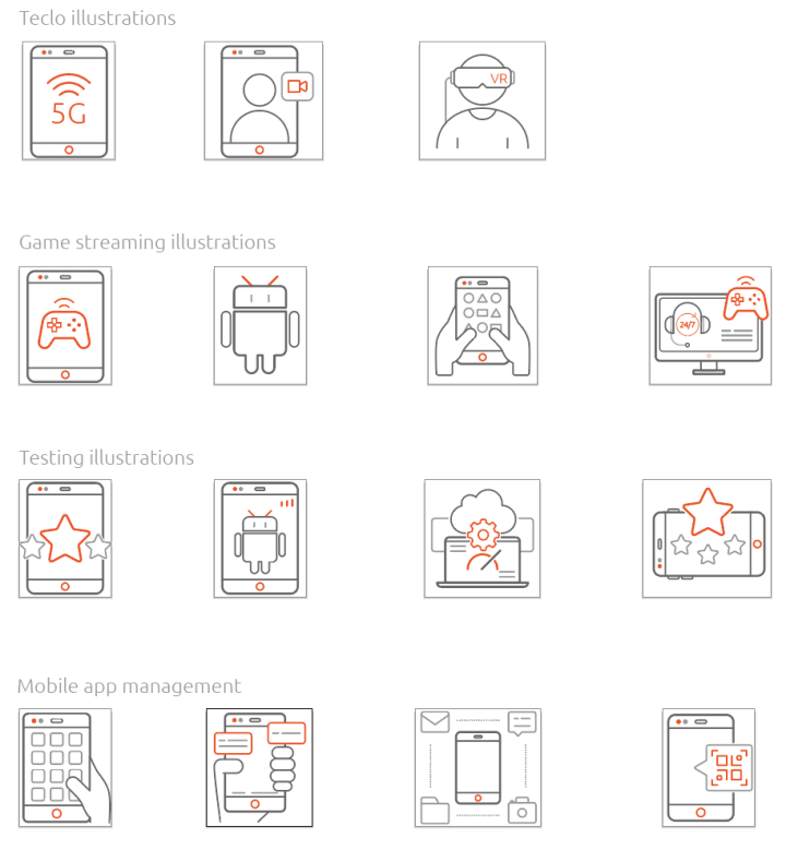
Anbox Cloud illustrations
We created a set of illustrations for Anbox Cloud to be utilised by the teams in the upcoming website and marketing updates.
Anbox Cloud video
Telling the story of the power of Anbox Cloud is a complex one, so we created a one minute video to briefly show users how easy it is to get started with Anbox that will be used online.

Posters
We have created some posters to be printed by businesses selling laptops with Ubuntu Desktop installed.

We developed a PDF with styled form fields allowing the business owners to add their own specific copy if needed.

MAAS
The MAAS squad develops the UI for the MAAS project.
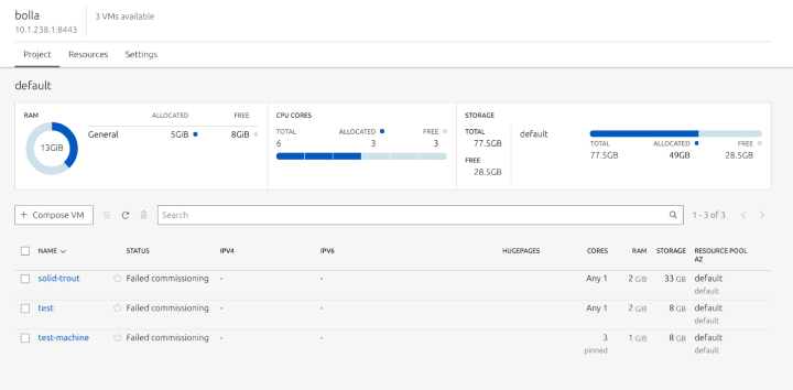
MAAS as LXD tenants is in QA
In this iteration, we wrapped up our feature work for MAAS as LXD tenants. From now on we can manage LXD projects via MAAS and also create a new LXD project in the LXD server via MAAS.

We added some UX enhancements to the table by showing the project overall core usage graph instead of the project-specific graph. From a big picture perspective, the graph did not make sense when the values did not add up properly.
Once a user looks into these individual projects, they will see an overall chart that helps them visualise existing resources efficiently and compose machines based on the information right provided by this view. We also created an action bar above the table so it has closer proximity to the action that they are going to perform. A user can now see relevant information and VMs that are pinned to the core number from here.
When you browse a resources page, you can see which core is pinned to the NUMA node, by switching to NUMA node view.

We have included a piece of secondary information about the available unpinned cores that a user can use when they compose a new VM. This reduces the cognitive load for our users when allocating resources to the VM when composing.
MAAS information architecture
One of the larger goals for this cycle was to revamp our information architecture. This is because we want to scale future features that we envisioned and make sure that the current architecture is suitable for scaling. We’ve discovered from our past usability research that many testers make the same mistake by clicking on the wrong tabs multiple times, which causes disengagement in the platform.
Last week we discovered a few leads from our “Cloud-like” survey. This week we’ve added some of the user stories from that survey to create two experiments that will help us define which category they fit.
In the experiment, we created an open card sorting study and sent it across the team in order for them to group these topics into a category that makes sense. We were fortunate enough to have 2 community contributors from discourse to help us with the card sorting experiment.
Once we received the results from participants, we define the weight or the similarity matrix between these topics using a K-means clustering technique. Below is the similarity matrix from our card sorting results. The first experiment is about creating machines, KVM, bulk actions, deployment and templating. The second experiment is about setting up a MAAS environment (normal or High Availability), setting up the network and routing tables, as well as setting up controllers.
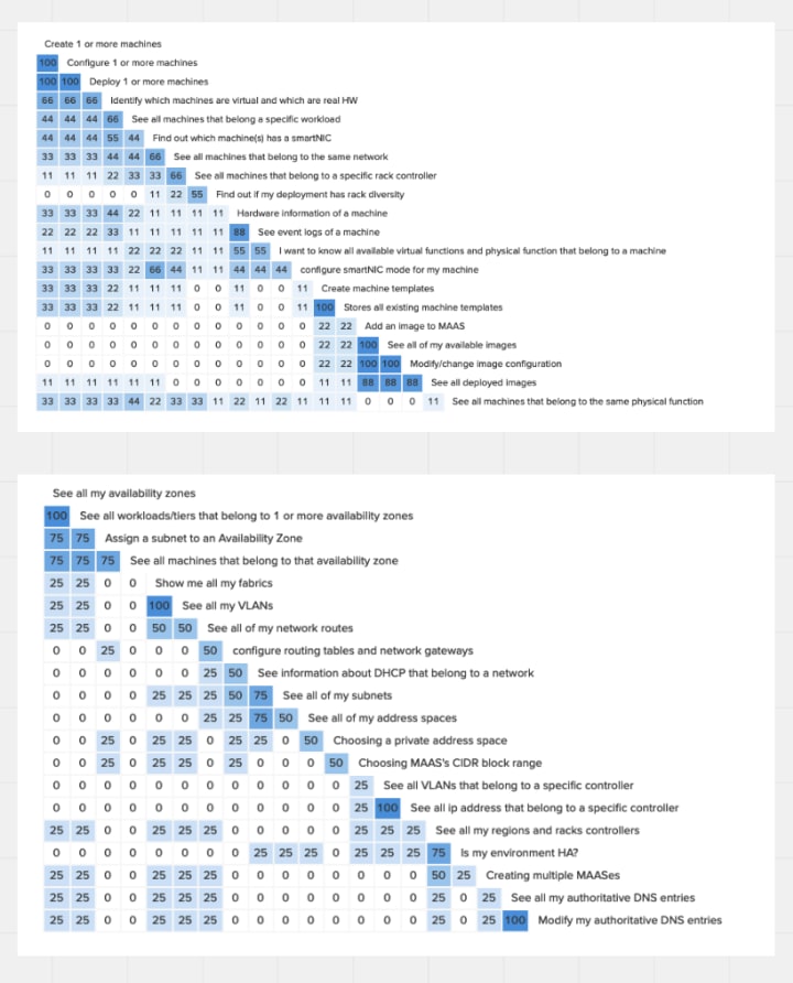
From the results in this matrix, we devised three possible enhancements for our information architecture. We are still exploring these with the team to redefine MAAS in a way that can scale the information architecture to fit our future vision and feature enhancements.
Maintenance
As we draw closer to the next MAAS release we’ve been fixing bugs and doing some much needed cleaning up.
We have completed the migration of our React code to use a Ducks or Slice based structure and we’ve removed a lot of legacy code for displaying machine details that are now handled by our React client. These changes resulted in a small milestone, we now have more TypeScript than JavaScript powering the MAAS UI
Not the most exciting news to most, but taking the time to do this tidying up means it is easier to add features and maintain the features we have.
JAAS
The JAAS squad develops the JAAS dashboard for the Juju project.
Improvements to the dashboard for Kubernetes environments
A key mission for the JAAS dashboard is to provide a high-quality experience for Kubernetes environments. In this iteration, we have focused on improving the dashboard on Kubernetes models
We added cloud logos across the dashboard to easily distinguish which provider type each model has. Also, there were a number of small data improvements to align the tables data with the data returned via the CLI.

The main change is that we have removed the machines view from the dashboard when viewing a Kubernetes model. This improves the experience for Kubernetes user by reducing the views that do not apply to the environment.
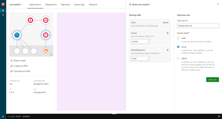
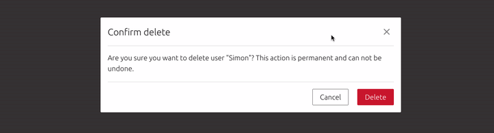
Sharing model UI
We’ve been focusing on the designs and experience for the sharing models feature. We incrementally improved this feature by allowing an admin the ability to invite new users to share a model, modify user access levels (read, write, admin) and remove users as well
Alongside the desktop experience, we also looked at the mobile experience as well as creating a quick prototype to demonstrate the interactions and transitions as creating and editing users provided instant feedback on the dashboard which would be hard to translate in documentation alone

Vanilla
The Vanilla squad designs and maintains the design system and Vanilla framework library. They ensure a consistent style throughout web assets.
Automating React components releases
We constantly work on improving the integration between Vanilla CSS library and our React components. One important aspect of these two packages’ coexistence is the consistency of their releases, so we worked on automating the releases for React components to make the process similar to the one we already implemented in Vanilla.
A combination of Release Drafter action to populate release notes and GitHub workflow that publishes package to npm automatically with every release will allow us to reduce the amount of manual work every time we want to release Vanilla and React components.

Modal focus accessibility
One of the outstanding issues we had after the accessibility audit was focus management in modal dialogs. We worked on improving our modal examples to show how the focus should be moved between elements when a modal dialog is opened and closed, and how the focus should not leave the dialog as long as it’s open
Snapcraft and Charmhub
The Snapcraft team works closely with the Store team to develop and maintain the Snap Store site and the upcoming Charmhub site.
Snapcraft
Brand store admin: Members and invites
In this iteration, we redesigned and developed the members and invites section of our brand store admin section. This includes the new design patterns which have been taken from some of our other products and evolved to match our use case.

Charmhub
Icons for bundles
We enabled bundles on Charmhub. A bundle is composed of a list of charms. Each charm has its own icon. We built a stack version of the charm icons to represent a bundle. The Kubeflow charm is an example of how this looks.

Team posts:
- A ‘How to’ on using Amazon Transcribe to type up user interviews
- Multiculturalism and globalisation in user experience
- Web team technical progression track
- [MAAS Information Architecture] Bring your expertise to MAAS! Round 2
- [MAAS Information Architecture] Bring your expertise to MAAS! Round 1
We are hiring
- Home-based – EMEA
Senior UX Designer ›
Be part of a team working on web applications for enterprise cloud services, IoT and embedded devices, bringing exciting new projects to life and improving existing one. - Home-based – EMEA
Web Developer ›
An exceptional opportunity for a web developer to work within a large team of UX and visual designers and developers building websites and apps.
With ♥ from Canonical web team.